7 Websites that Awe and Inspire With their Responsive Design
Responsive websites are in vogue, and rightly so. Since the dawn of time, user-friendliness has dictated the success or the lack of it for any product across any domain, and websites are no different. A non-responsive website takes a major hit on the responsiveness scale, simply for the fact that it does not feel accessible on diverse platforms. Therefore, we see highly responsive websites springing all around us.
The Internet is filled with websites that seriously take into account an array of operating systems and devices. We are going to throw light on some such websites that truly inspire and awe the webmasters who intend to build websites that do not fall short on this scale:
Skinny Ties
Skinny ties keeps things skinny with its page size and the overall load on server as well. The website is remarkably slim and looks sleek and chrome on every device that is out there. It offers amazingly fast loading times and also boasts visually appealing design.
Disney
Disney is a legend among trendsetters of planet earth. So when the trends seemed to be leaning towards responsiveness, how could you expect it to be left behind! That said, their website has been true to their business and thus contains a truckload of heavy-handed imagery and animations. Making all this work responsively was indeed an uphill task, but one that has been performed with a rhythmic charge. You can view the Disney website on desktops as well as mobile devices with much smaller screens in a truly compatible environment. Nothing is as inspiring as the heavily loaded Disney website retaining its responsiveness and browser-friendliness.
Awwwards
If you have been part of the web industry from quite a while, there is a slim chance that you haven’t come across Awwwards yet. This site compiles some of the most stunning websites from all across the web and displays them in thumbnail views that are pretty large sized and look beautiful. So, there is a lot of imagery involved and yet, it can be accessed seamlessly across different platforms and devices.
Food Sense
Again, a food blog is something that involves a lot of high definition imagery. So keeping it responsive in nature makes for one difficult task. The website of Food Sense will however make you believe otherwise. This portal contains some breathtakingly beautiful design elements, but no compromises have been made on the responsive side of things. None at all.
Starbucks
A massive brand, Starbucks has made sure it reaches out to its customers on a large scale via the web. It uses a grid design to create a website that is easy on eyes and works smoothly on different platforms. The website offers a quick loading time and contains some exceptional features like store locator.
Food Marketing Institute
Food Marketing Institute is also one of those websites that contains a truckload of information about America’s retail food industry. It thus is a very busy site that is filled with all sorts of tiny and big bits spread all across its pages. However, all the information has been organized in a manner most clean and this lends responsiveness to the site. However, for the landing page, the website is partially responsive, it breaks at screens less than 500px in width.
World Wildlife Fund
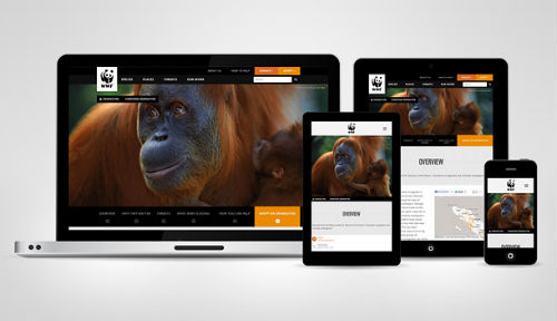
As you might guess, the website of World Wildlife Fund is filled with stunning pictures of animals and other wild species. Typically, this should put a lot of load on the website, affecting its responsiveness. However, the webmasters have done a great job of placing the CTA buttons at the right spots. The mobile slider feature truly rocks!
So, get all the inspiration you can under the hood.
Your Turn to Talk
Do you have any other awsome Responsive website to share? I know there are plenty more. If you have anything to say, please share your opinion in the comments section. Your opinion matters, unless it is a Spam.


I liked your post. Keep up sharing such great post with us.