How To Create an Animated and Stateful Menu Toggle Using Only CSS
In today’s competitive web world, keeping your users engaged with your web solution can be a challenging job. Nowadays, people prefer viewing content that is not only unique but also interactive. So, if you want to communicate your message to clients in an interactive manner and seeking ways to attract good traffic to your site, then animation is an investment worth making.
Animations when used wisely can help in improving your users’ online experiences. Today, you can find several websites that make use of animated and toggle effects to make a design persuasive enough to drive traffic. Basically, many designers and developers today use animated elements with effects like slide, drop-down, etc. to make their design visually more appealing.
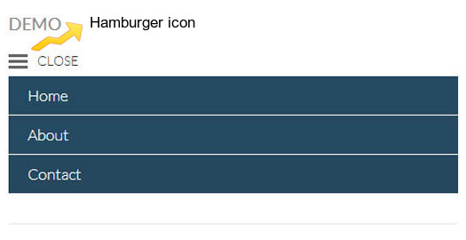
For example, mobile websites make use of navigation containing toggle effects wherein the hamburger icon (also known as 3 line menu navicon) is used to open up the hidden navigation items and "CLOSE" is used to hide those items again, as you can see in the following image:

Fig1. Navigation with Open/Close toggle effects.
So now that you are convinced on adding animations in your design, there are two ways in which you can start experimenting with web animation. You can either write CSS for embedding animations in your design or use JavaScript for creating animations. For instance, most web developers use JavaScript for implementing toggle effects, however, working with JavaScript can be daunting for novice designers and developers.
In this post, I will show you an example of toggling the OPEN/CLOSE states of a menu using only CSS.
Example: Demonstrating the Process of Creating a Menu Toggle Switch With CSS Only
As users are becoming more accustomed to using mobile devices than desktop computers for browsing the web, having a website that is not optimized for mobile use can make you lose many potential customers. This is why mobile-optimized design have become an important part of almost any web development project.
When creating a mobile website design, focus on creating content for small screen displays. For instance, the main navigation menu must be short, of course, and you can’t display all the navigation items as you would on a desktop version of your website. You can hide your navigation menu items and add an option to enable users to view the hidden menu items when needed. One great way to do so requires creating an off-canvas menu.
Below are few steps which to create a standard off-canvas menu with a toggle (sliding) effect using only CSS:
Step1. Write HTML to lay down the foundation of your design.
First, you will have to write HTML markup to create a menu toggle switch for your off-canvas menu.
<!-- enter the start of your HTML markup here... -->
<ul class="nav-menu">
<li class="nav-item"><a href="#">Home</a></li>
<li class="nav-item"><a href="#">Company Profile</a></li>
<li class="nav-item"><a href="#">Product Offerings</a></li>
<li class="nav-item"><a href="#">Contact</a></li>
</ul>
<input type="checkbox" id="nav-trigger" class="nav-trigger" />
<label for="nav-trigger"></label>
<div class="site-wrap">
<!-- enter the rest of your HTML markup here. -->
</div>
The above HTML markup comprises of three main elements: the main navigation menu, a check-box along with a label, and your website content.
Step2. Use CSS to embed toggle effect in your navigation menu.
Once you completed writing the HTML markup, next you just need to add style to your navigation menu. Most importantly, you need to turn the menu into an off-canvas menu that when clicked triggers the toggle effect. To implement this, use the following code:
.nav-trigger:checked + label {
	left: 210px;
}
.nav-trigger:checked ~ .site-wrap {
	left: 200px;
	box-shadow: 0 0 5px 5px rgba(0,0,0,0.5);
}
The above code snippet has two declaration blocks:
- The First declaration block contains a CSS selector ".nav-trigger:checked + label". This selector provides control over the trigger position of your menu. Furthermore, "left: 210px" determines the position of the toggle when the menu is open.
- The Second declaration block has a "site-wrap" element that ascertains that the content of your website will be covering the complete menu. In addition, a box-shadow element is defined for improving the look and feel of the menu.
Output:
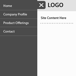
The image below (Fig2.) is what the browser will render once you implemented Step1. and Step2.
View the TOGGLE MENU DEMO at the end of this post. Use the "View Page Source" in your browser to view the full source code.

Fig2. Browser’s Display of the Menu from adding the HTML and CSS code above.
Full source code in the DEMO at the end of this post.
Step3. Adding transition effect
You may want to change your menu trigger to a more advanced form of the element. Let’s suppose, you would like to change the menu trigger from traditional check-box to the widely-used hamburger icon. To do so, see the code given below:
.nav-trigger + label, .site-wrap {
     transition: left 0.2s;
}
Note: Remember that you will have to hide "overflow on the x-axis" in your <body> tag. Neglecting it won’t let your users scroll the window of your web page to left or right as soon as the menu is expanded. This can be achieved with the following code:
body {
    overflow-x: hidden;
}
Summing Up!
Hopefully that the example included in this post will give a good idea as to how you can add the Menu toggle effects using only CSS. I discussed how you can add animated and toggle states in the navigation menu. But keep on experimenting to find what other toggle effects you can create with the help of CSS.
If you have anything to say, please share your opinion in the comments section. Your opinion matters, unless it is a Spam.
View Demo
View the TOGGLE MENU DEMO.
NOTE: Use the "View Page Source" in your browser to view the full source code.


