5 Major CSS Changes Introduced With Latest Bootstrap Version 3

Twitter Bootstrap is one of the most sought-after open source front-end framework that help in developing responsive and mobile-first projects. It contains a collection of tools such as the HTML and CSS-based design templates for several interface components (like typography, button, forms, etc.) and optional JS extensions. These tools are used for creating websites, as well as, web applications. While Bootstrap version 2 (or v2) was released to support responsive web design, the release of Bootstrap 3 (also referred to as BS3 or v3) focused on using mobile first approach and flat design.
If you plan on moving to the latest version of Bootstrap (Currently V3.3.4), it would be better to learn about the changes that have been introduced with Bootstrap 3. In this post, we’ll have a quick look at the changed CSS features in v3.
1. Additions made to the Table Classes
The table style in Bootstrap 3 remains to be same as v2. Even, the classes used for adding optional styles to the tables – such as table-striped, table-bordered, table-hover, and table-condensed – work in the exact same manner as they did in v2.
However, one slight change you’ll notice in BS3 is that the table-striped class used for adding zebra-style striping style to the tables now make use of the :nth-child CSS selector. This means that this style no longer works in Internet Explorer 8.
Moreover, two new additions can be noticed in the classes used for highlighting the rows of the table. First off, a new class named as “active” has been introduced in BS3. The class is now available on all of the elements of the table classes, unlike the previous Bootstrap versions, wherein the active class was available only with the navigation and button elements. But, with Bootstrap 3, you can now apply the active class to a
2. Changes made to the Buttons
The first major change you’ll be able to see in the classes used for styling the default button. In v2 using the “btn” class helped in controlling the look and feel of the default button, as follows:
<button class="btn" type="button">Default button</button>
However, in BS3 adding “btn” only won’t help you add any effect. For styling the default button, you’ll need to explicitly add “btn-default” along with “btn”, as shown in the following line of code:
<a class="btn btn-default" href="#" role="button">Link</a>
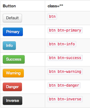
Another change is that btn-inverse class no longer needs to be used in BS3. The below image presents the available button classes in v2:

From Bootstrap 3 onwards, the button classes available are:

Lastly, the most prominent change that has been made in BS3 is that the classes used in v2 called as .btn-large, .btn-small, or .btn-mini – have been replaced with new classes – such as .btn-lg, .btn-sm, and .btn-xs, respectively.
3. Image Changes
You can see a lot of CSS changes in the way image tag is used. Before the release of BS3, you need to use the optional responsive classes in the <img> tag, since they were not responsive by default. But, sadly, even after using such optional classes, truly responsive solutions were not achieved.
But, Bootstrap 3 has introduced many image changes. Most importantly, the images are now fully responsive, by default. And simply by making use of the <img> tag, the images will be responsive.
However, you can choose to add more responsiveness to your images, by adding the “img-responsive” class to any <img> tag. Using this class, you can get assured that the images will scale nicely.
Furthermore, another change that has been made to the image section is that the img-polaroid classname has been changed to img-thumbnail.
4. Changes made to the Typography
In Bootstrap 2, users haven’t had any choice and were forced to wrap an <h1> tag in a page-header div. This is because, it helped in making the <small> tag output neatly leveled. But this has changed with BS3.
In Bootstrap 3, the headings, H1 through H6 are treated in the same manner they were in v2, however, you can now use tag to create secondary text in any header element without having to wrap that tag in a div (via the “page-header” class).
In essence, you no longer would need to add any extra markup from BS3 onwards, except for the case when the heading of any block needs to be underlined using some different paragraph margin.
<div class="container">
  <div class="page-header">
     <h1>This is my new webpage <small>You'll definitely fall in love with!</small></h1>
  </div>
  <p class="lead">Welcome to my test page. </p>
</div>
Output:

5. Form Changes
Lastly, let’s now talk about the changes made to the forms. In BS2, most of the classes used for styling the forms had a narrow scope. Instead of using a single class that covered many bases, one had to create a separate class for many different purposes. But, this is no longer the case with Bootstrap 3. This means, now you can create a single class for handling several things.
For example, you can now handle how the input boxes and text areas are aligned in the form using one single class.
Conclusion
Have you been still stuck with using Bootstrap 2, well then it’s time you should migrate to the latest Bootstrap 3 version as it introduces plenty of CSS changes – and for good reason. Reading the post, will make you know about the most important CSS changes of BS3.
If you have anything to say, please share your opinion in the comments section. Your opinion matters, unless it is a Spam.


