BAC Software Consulting
“Reliable Information Technology Experts – Not merely a software consulting company – a strategic technology partner that supports your IT road map”

“Reliable Information Technology Experts – Not merely a software consulting company – a strategic technology partner that supports your IT road map”

Deep Domain Expertise in Internet and Publishing Industry

Exceptional Technology Capability to Drive Value

Robust Process Infrastructure to Ensure High Quality Delivery
Get Access to Highly Skilled Technology Resources at short notice, Significantly Reduce total cost of product development and expedite software product delivery without impacting business risks.


Get benefits of BAC in-house value accelerators to cut development costs, increase scalability, enhance reliability and improve performance of your Internet Products. A value far beyond plain cost savings and staff augmentation offered by other technology vendors.

When it comes to Internet and Publishing domain expertise, BAC has measured the depth and breadth of this universe. Our tech consultants are in a position to lead from the front and suggest ways to solve any business & technology challenges in this domain

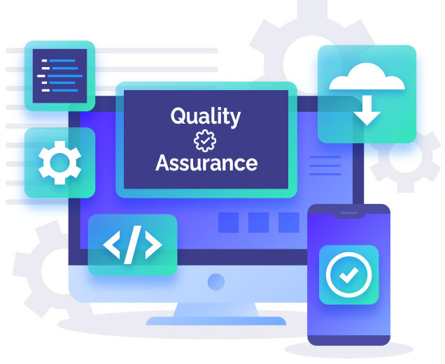
Get advantage of an independent offshore test team to reduce testing costs and time to market. BAC can be your unbiased testing partner to give your product quality a boost by providing highly skilled test teams and access to evolved software testing processes.
Strong combination of mature development processes, strong program management infrastructure and Quality Management Systems ensure high quality delivery first time and every time


Get benefit of technology experts well versed in your technology to augment your technology teams. BAC has expertise in developing web services (On demand, asp applications), LAMP & Open Source, J2EE & .Net technologies
