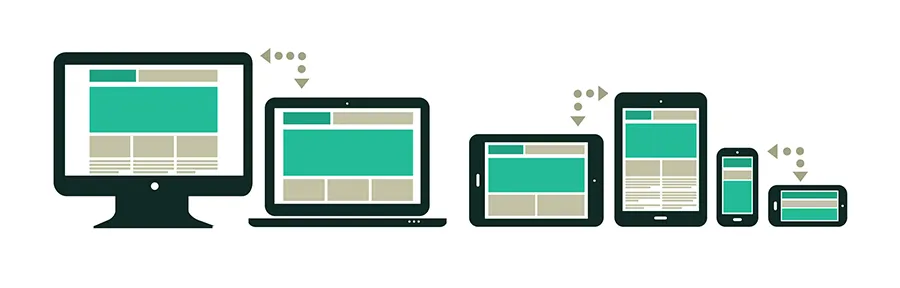
You’ve no doubt heard the term by now, but what exactly is Responsive Web Design? As the name suggests, Responsive Web Design (from hereon in referred to as RWD) is about designing your web site with the use of media queries so that it responds (changes the presentation) to the web browser width, or in the case of mobile devices, the capabilities of said device. Essentially it’s about building a web site that’s device unbiased.
In this article I’ll demonstrate a basic example which should get your creative juices flowing.
How it used to work
In the olden days a web designer would typically use Javascript to detect the browser size and redirect to one of the many versions of the web site that had been specifically created for whatever resolution your browser was using. This technique was also sometimes used to serve up different versions of the site depending on what browser you used.
The biggest problem with this method, aside from the fact that you had to write different HTML for each version of the site you wished to present, was that it didn’t cater for browser resizing or various monitor resolutions, which meant the user would have to reload to ‘correct’ the page. It also didn’t cater for different aspect ratios.
Sadly I see this method still in use on many sites, though it’s likely those sites are still using legacy technology and simply haven’t thought about joining the rest of us cool kids in this century.
How Responsive Web Design works
At it’s core RWD is pretty basic. You write your CSS for different browser sizes, device capabilities and aspect ratios using a cool little thing called ‘media queries’. As the name suggests, media queries will query the media you are using and use the appropriate CSS (respond) in real-time (without reloading the page).
The best part of this is the user can change their minds – rotate a tablet from landscape to portrait for example, or switch to a different device – and experience the appropriate presentation of the web site without the need for any manual intervention.
From a user experience perspective this is invaluable, assuming the designer has done a good job. Taking another example, on a mobile device with limited screen real-estate, the designer can make sure the text is more legible (usually larger), and that buttons, input fields and other elements are all presented in a way that makes for easy interaction with clumsy finger taps, as opposed to the accuracy required by a mouse/desktop browser combo.
Likewise multi-column layouts simply don’t work on smaller devices, so ideally you’ll want to reduce the number of columns or present just one.
Advantages:
- A single code base
- Cater for varying monitor resolutions, device resolutions and aspect ratios
- Relatively easy to maintain
- Allows the designer to present a device-specific user experience
- You don’t have to market a mobile specific URL (for example, m.thatwebguyblog.com or similar)
Disadvantages:
- A single code base *
- More planning
- Retro-fitting can be a bitch (don’t make it an afterthought – plan early!)
- Longer development cycle (debatable)
* I know I mentioned a single code base as an advantage and also a disadvantage, and here’s why. Because media queries only allow control over the presentation, this means all the HTML is loaded regardless of how much of it you want to present. If, for example, you have a site that has a couple of sidebars and a large image cycle, and you want to hide these for a smaller screen, you can only achieve this with display:none on said elements. But as you’ve probably already guessed the HTML is still being loaded. This is not optimal, and there’s nothing that media queries offer that will get around that fact, so it’s something to just keep in mind.
Media Queries in action
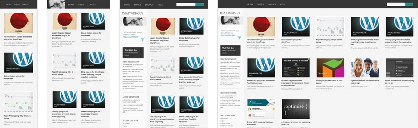
If you’re reading this blog on a desktop browser, hit it on a mobile device and you’ll see a drastic change. Feel free to rotate your device and you’ll see a slightly different version, but they are all optimised for one experience or another.
Or if you’re using a browser that supports media queries, try resizing it smaller on this web site. You’ll notice I’m dropping the sidebar, re-organising the menu, optimising the size of certain anchors for finger interaction, and repositioning some elements for aesthetic improvement on smaller screens.
How to implement media queries
The first thing you’ll want to do is disable the mobile browser scaling ability. This will force the site to appear as you intend, rather than the zoomed out over-view mode that most mobile browsers have enabled by default.
<!--/ Prevent Mobile Browser Scaling /-->
<meta name="viewport" content="width=device-width, initial-scale=1.0" />
A basic Media Queries style sheet
Now onto the fun bits. For this tutorial we are just going to assume you already know how to present a desktop version of a web site and you now want to cater for a few specific device resolutions.
Be sure to add your media queries style sheet…
<!--/ Media Queries /--><link href="css/media_queries.css" rel="stylesheet" type="text/css" />…and then start specifying your different presentations:
/* If 800px or less
-----------------------------------------------------------------------*/
@media screen
and (max-width: 800px) {
    /* Your Styles */
}

/* If 480px or less
-----------------------------------------------------------------------*/
@media screen
and (max-width: 480px) {
    /* Your Styles */
}
You can also get fancy by declaring minimum and maximum device widths, for example:
/* Smart phones (portrait and landscape)
-----------------------------------------------------------------------*/
@media screen
and (min-device-width : 480px)
and (max-device-width : 800px) {
 /* Your Styles */
}

/* iPad (portrait and landscape)
-----------------------------------------------------------------------*/
@media screen
and (min-device-width : 768px)
and (max-device-width : 1024px) {
    /* Your Styles */
}

/* Android Tablets (galaxy tab 10.1, motorola xoom, portrait and landscape)
-----------------------------------------------------------------------*/
@media screen
and (min-device-width : 800px)
and (max-device-width : 1280px) {
    /* Your Styles */
}
This is by no means an exhaustive list of standard device resolutions or possibilities, and you’d be doing yourself a favour to read the official W3C spec on Media Queries. You’ll need to decide on the device conditions you want to support, and although I’m almost certain there are web sites out there that have a ‘standard’ list you can follow I’d suggest revising it yourself every now and then lest you get stuck using a set of rules that no longer apply one day, or worse, doing what a lot of web designers are doing and only supporting iPhone and iPad (even though there are more Android devices out there).
The problem with pixels
I debated about including this part, but I guess it might be useful in helping resolve some quirks. Many tablet displays now have ‘retina displays’ (or some other wanky marketing name) which means that pixels are no longer pixels in the traditional sense and what we’re really seeing are virtual pixels, or, Density Independent Pixels (DIP). This means for the first time pixels are now a relative unit of measurement <sarcasm>which is just what every web designer has ever wanted</sarcasm>.
This can lead to problems on some devices. For example, the Samsung Galaxy SII display (which also has a wanky marketing name – the Super AMOLED Plus) has a resolution of 800 x 480 in portrait mode, but a media query commanding an 800 pixel wide layout will actually not work as expected because one virtual pixel on this device is equal to 1.5 physical pixels, which means you’ll need to specify the width to be 533 pixels (800 / 1.5 = 533).
Confused? I certainly was before learning that particular quirk, and if you’re experiencing problems on a particular device then this could be the cause. Thankfully Quirks Mode has an excellent article that explains it far better than I can here.
The future
The truth is things are about to get interesting given the number of devices on the horizon that have higher resolutions than most desktop monitors.
With this in mind, we are going to have to think about how we can present web pages for insane resolutions like the upcoming Android and Apple tablets that are alleged to support resolutions over 2000 pixels wide. When was the last time you designed for that number?
You can easily target the high density device display…
@media screen
and (min-device-pixel-ratio : 1.5) {
    /* Your Styles */
}
…and consider that high resolutions may afford better user experience possibilities. Just saying.
Obviously this makes designing a bit more challenging, as you’ll now have to think about how that pixel perfect mock-up is going to translate into a handful of different devices. Which elements will be visible or hidden, and under what conditions? How will you present certain elements for one set of users compared to another? How will the user experience be compromised or enhanced?
And most importantly, your content should have a clear hierarchy so you understand what is most and least important, as you may find yourself in a position where you have to hide less important text on smaller resolution devices.