How To Create a Responsive Menu Without jQuery
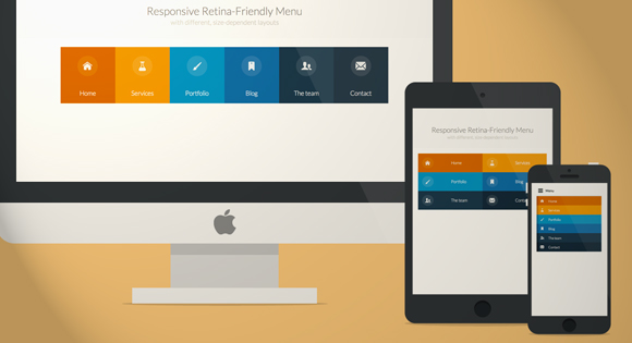
Responsive designs are fad today, and not surprisingly. In the Internet age where usability is the biggest metric of a website’s quality, responsiveness is something that can’t be compromised upon. And slick navigational menus are pursued with an even keener desire.
Now, designers and developers are channelizing the best and the most state-of-the-art resources to inject this responsiveness in websites they are building and jQuery happens to be at the center of it all.
That said, using jQuery can become an unwieldy exercise at times. Not everyone is well versed with it and thus it leads to number of confusions. So, such folks are always looking for alternatives and the good news for them is, there are a plenty of alternatives.
The combination of HTML, CSS and JavaScript can accomplish the most intricate of tasks, and with absolutely great results. But when used expertly and in the most ideal manner, CSS does not need JavaScript.
We will put forth a tutorial to show how you can create a responsive navigation menu without having to deal with jQuery. One thing worth knowing is that Viewport is an absolute must when building responsive design – with or without jQuery. And we are going to include it in our code as well.
Working on the HTML
We first chart out the page structure where the HTML5 doctype is declared. The nested unordered list is included right within the body tags. Here is the complete HTML:
Note: To scroll within the code, you can also click on the code window and use your keyboard´s arrow keys.
<!doctype html>
<html lang="en">
<head>
<meta charset="UTF-8">
<title>CSS Only Navigation Menu</title>
<meta name="viewport" content="width=device-width,initial-scale=1">
<link rel="stylesheet" href="style.css">
</head>
<body>
<ul id="menu">
<li><a href="#">Home</a></li>
<li>
<a href="#">About ↓</a>
<ul class="hidden">
<li><a href="#">Who We Are</a></li>
<li><a href="#">What We Do</a></li>
</ul>
</li>
<li>
<a href="#">Portfolio ↓</a>
<ul class="hidden">
<li><a href="#">Photography</a></li>
<li><a href="#">Web & User Interface Design</a></li>
<li><a href="#">Illustration</a></li>
</ul>
</li>
<li><a href="#">News</a></li>
<li><a href="#">Contact</a></li>
</ul>
</body>
</html>Writing the CSS
Fisrt of all, the CSS implements some root-level styling on the ul and li elements. For making sure that the menu is displayed horizontally, we use inline-block and float:left attributes.
/*Strip the ul of padding and list styling*/
ul {
    list-style-type:none;
    margin:0;
    padding:0;
    position: absolute;
}
/*Create a horizontal list with spacing*/
li {
    display:inline-block;
    float: left;
    margin-right: 1px;
}
We now add more attributes that are primarily meant to enhance the visual appeal. Here is the code that you can play around with in order to style the menu on your own terms:
/*Style for menu links*/
li a {
    display:block;
    min-width:140px;
    height: 50px;
    text-align: center;
    line-height: 50px;
    font-family: "Helvetica Neue", Helvetica, Arial, sans-serif;
    color: #fff;
    background: #2f3036;
    text-decoration: none;
}
/*Hover state for top level links*/
li:hover a {
    background: #19c589;
}
/*Style for dropdown links*/
li:hover ul a {
    background: #f3f3f3;
    color: #2f3036;
    height: 40px;
    line-height: 40px;
}
/*Hover state for dropdown links*/
li:hover ul a:hover {
    background: #19c589;
    color: #fff;
}
We will also add some styling to the dropdown links and note that you cannot view the first class representing the dropdown by default.
/*Hide dropdown links until they are needed*/
li ul {
display: none;
}
/*Make dropdown links vertical*/
li ul li {
    display: block;
    float: none;
}
/*Prevent text wrapping*/
li ul li a {
    width: auto;
    min-width: 100px;
    padding: 0 20px;
    text-align:left;
}
/*Display the dropdown on hover*/
ul li a:hover + .hidden, .hidden:hover {
    display: block;
}
So far, We have a navigation menu that is perfect for desktops. But since we are talking about responsiveness, we also need to take into account tablets and mobile devices. This is where the media tags come into play. Using a media query, we can set a maximum width and then make certain code alterations accordingly.
Of course, here you can have different ranges of screen sizes that you can tailor the code. I am only checking for for < =760px screen width to keep things simple.
/*Responsive Styles*/

@media screen and (max-width : 760px){
/*Make dropdown links appear inline*/
 ul {
    position: static;
    display: none;
 }
/*Create vertical spacing*/
 li {
    margin-bottom: 1px;
 }
 /*Make all menu links full width and center the text*/
 ul li, li a {
    width: 100%;
 }
 li ul li a {
 text-align:center;
 }
}
Saving Some Space on Mobile Devices
Let’s give mobile users an option wherein they have a button to display the complete menu so that the default setting saves them some space. The default would be a collapsed menu. We we add the HTML.
<label for="show-menu" class="show-menu">Show Menu</label>
<input type="checkbox" id="show-menu" role="button">
If you look at the code carefully, you will note the input’s id is using the for attribute of the label, which goes on to establish the relation.
Now we will add the CSS outside the media query:
/*Style 'show menu' label button and hide it by default*/
.show-menu {
    font-family: "Helvetica Neue", Helvetica, Arial, sans-serif;
    text-decoration: none;
    color: #fff;
    background: #19c589;
    text-align: center;
    padding: 10px 0;
    display: none;
}
/*Hide checkbox*/
input[type=checkbox]{
    display: none;
}
/*Show menu when invisible checkbox is checked*/
input[type=checkbox]:checked ~ #menu {
    display: block;
}
And ADD this code within the media query:
/*Display 'show menu' link*/
.show-menu {
    display:block;
}
/*Pointer on Hover, so that the user knows of an active link*/
    .show-menu:hover {
        cursor:pointer;
    }
/*Center the text*/
li ul li a {
    text-align:center;
}
Above, the code below the /*Hide checkbox*/ makes sure that the menu is hidden by default until the user clicks on the button.
Your Turn to Talk
This tutorial is the most practical way to create responsive designs with jQuery and definitely an easy-to-follow sequence of steps.


