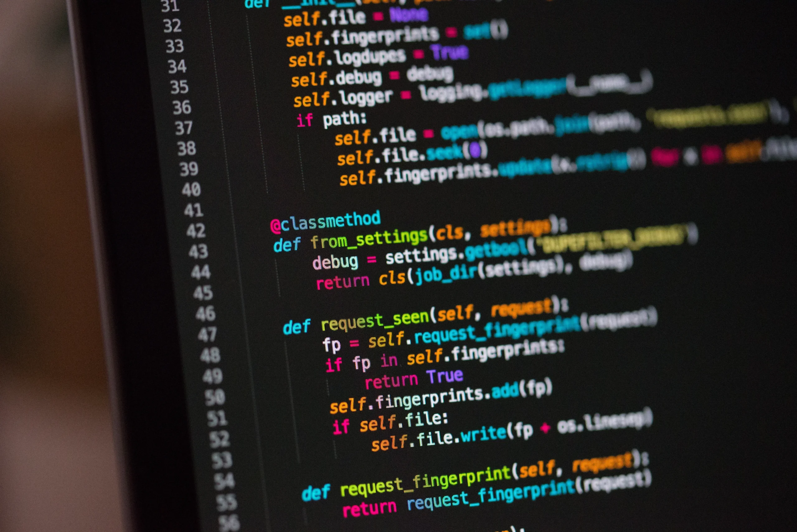
There are several advantages to coding with an alternative font, the most notable, depending on your selection, is being able to see more code along the horizontal axis before having to scroll. Unless you use word wrap in which case point becomes less irrelevant.
Droid Sans Mono
This is actually pretty nice, and my preferred programming font now. Droid Sans Mono belongs to Google’s Droid font family, which was naturally developed for their Android platform. At size 10 it has very nice kerning, and if you’re using it on a screen with a lower res it’s still very usable at 9 point allowing more code on screen.
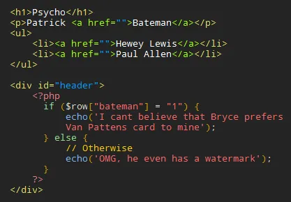
Proggy Font
With a name like that there’s no mistaking what Proggy Font is intended for. This font comes in a stack of different flavours, but for me Proggy Font Crisp and Proggy Font Clean are the most suitable among them.
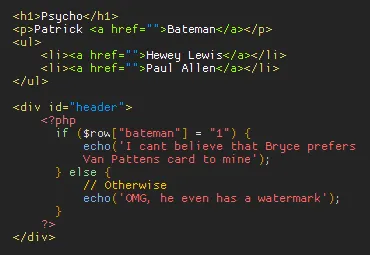
Lucida Console
This looks particularly nice in lower-case, and is also the same font I use in my command window (probably not a coincidence given its name). If you’re on a Windows machine the chances are you will already have this font, but if not you can grab it from here.
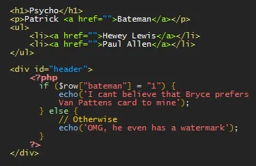
ProFont
When you just have to make the most of every available pixel of screen real-estate, ProFont might be for you. It’s tiny, but it’s still legible, except the difference in space after the opening < and before the closing > is quite drastic, particularly on the UL. Seriously – how tiny is that?
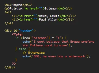
Envy Code R
This offering was suggested by a work colleague. As well as having a cool name, Envy Code R has been Jason’s coding font of choice for a while. It’s a sans serif font with a generous amount of space between each character, though in my opinion there’s a little too much line height.

Just in case…
If you’re interesting in giving any of these a go, make note of what your current font is in your application. Chances are it’s Courier New, but if you don’t like any of these you’ll probably want to go back to what you had.